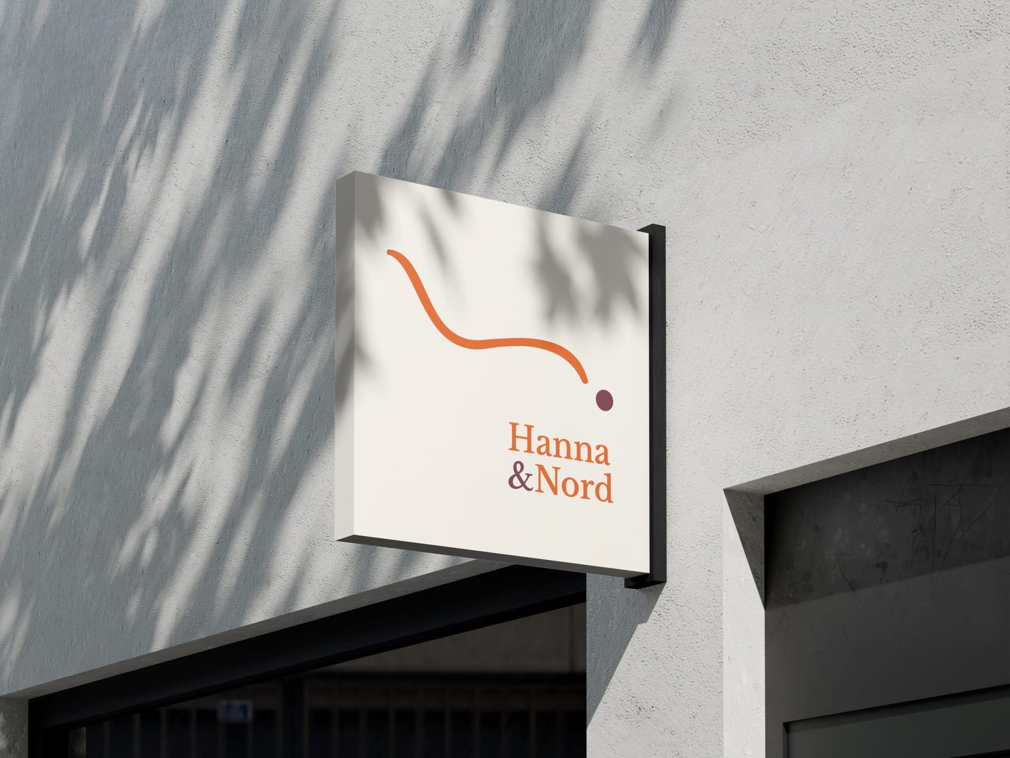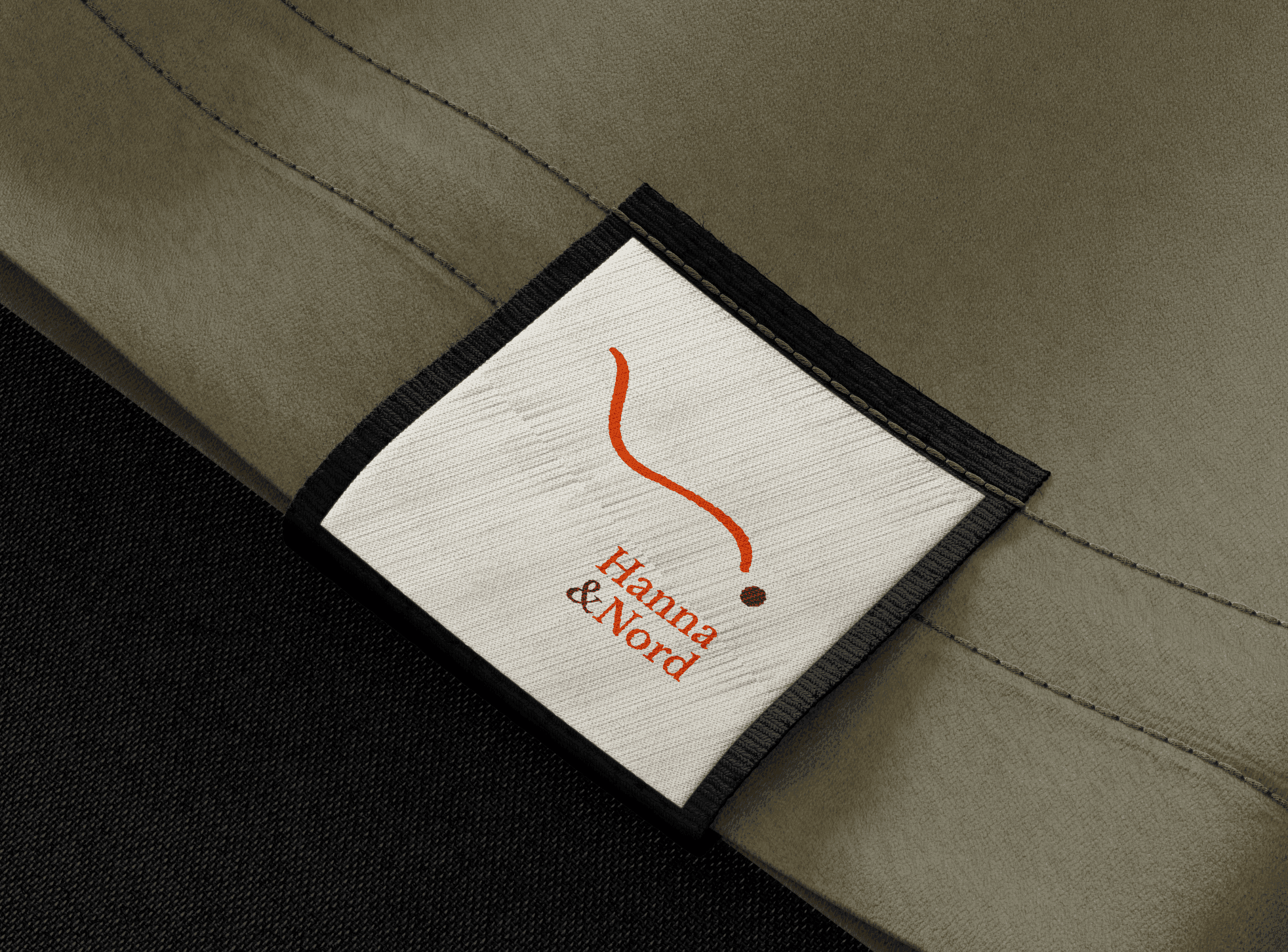
Context & Challenge
The online furniture market is overwhelming. Too many choices, inflated promises, and very little genuine trust. Consumers scroll through endless digital catalogs, constantly comparing prices and styles, only to be left with the persistent anxiety: “What if this doesn’t feel right in my space?” Hanna & Nord refused to jump onto that bandwagon with louder claims, steeper discounts, or fast-trend cycling. Their ambition was far more demanding: to build a brand that feels like a sanctuary. A place where aesthetics, sustainability, and calm converge—where people feel empowered to choose with confidence rather than gamble. The conventional approach of flashy imagery, buzzwords, and rapid turnover would only exacerbate the problem.
The Strategy & Concept
If you communicate like every other furniture retailer, you will be treated as one. We took the deliberate opposite path. We did not start from inventory; we started from a purpose. Hanna & Nord was positioned as something rare in modern e-commerce: a trusted guide. A brand that resolves decision fatigue rather than exploiting it. Not by dumbing down choices, but by curating, slowing down, and substantiating every recommendation. The core thesis was unmistakable: this brand does not merely sell furniture; it provides certainty and serenity. Every subsequent touchpoint had to breathe this ethos.
Execution & Action
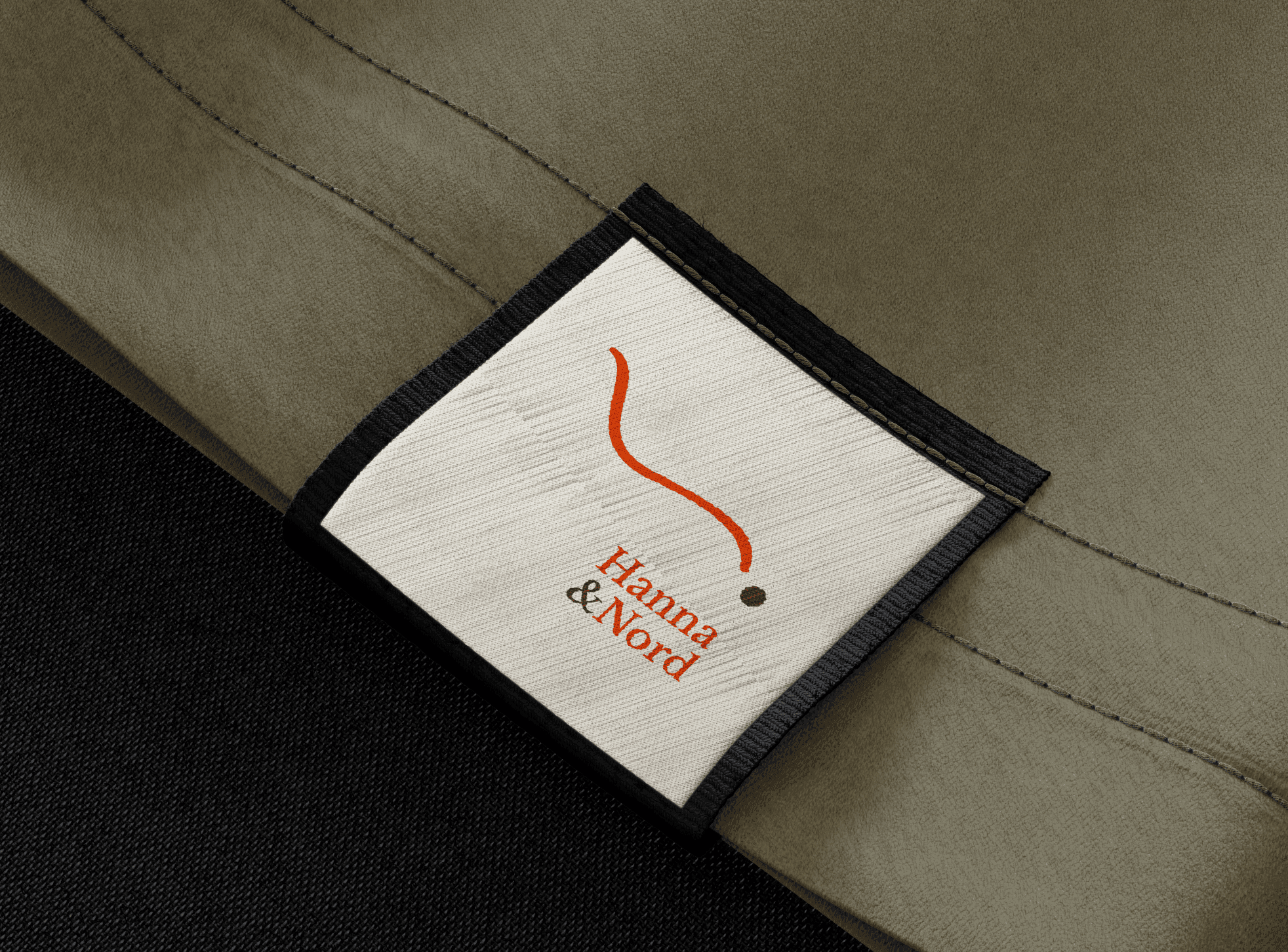
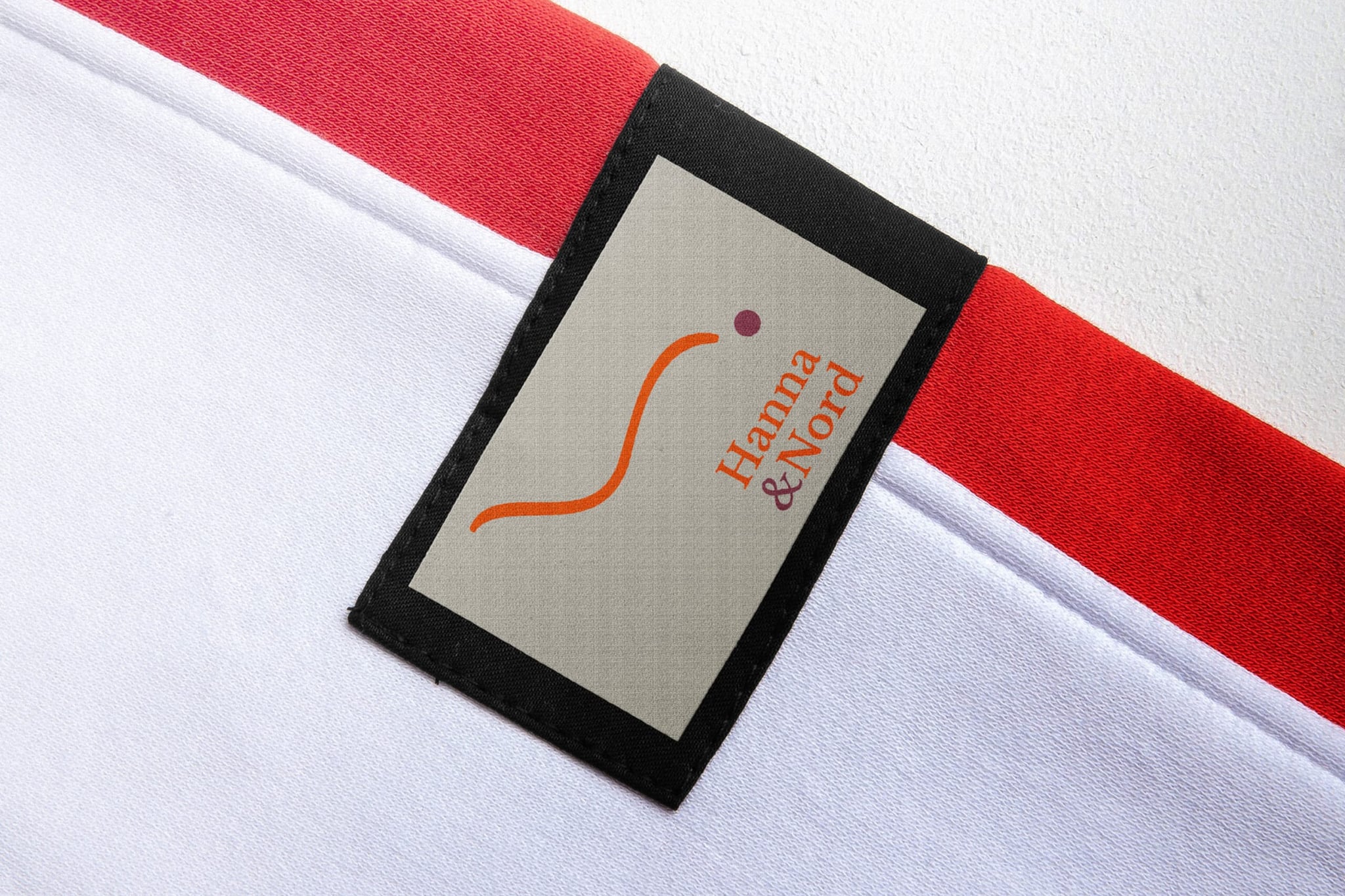
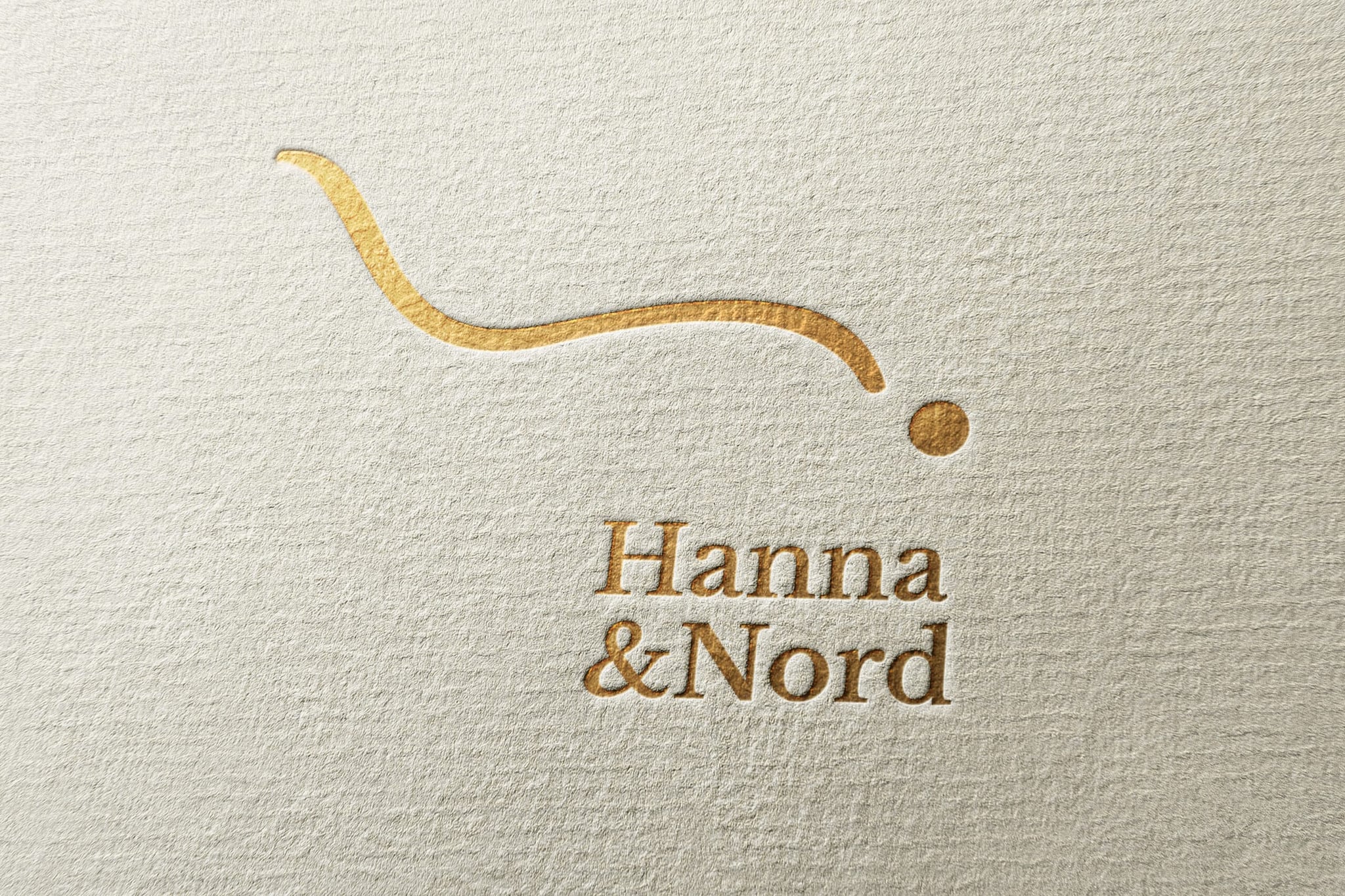
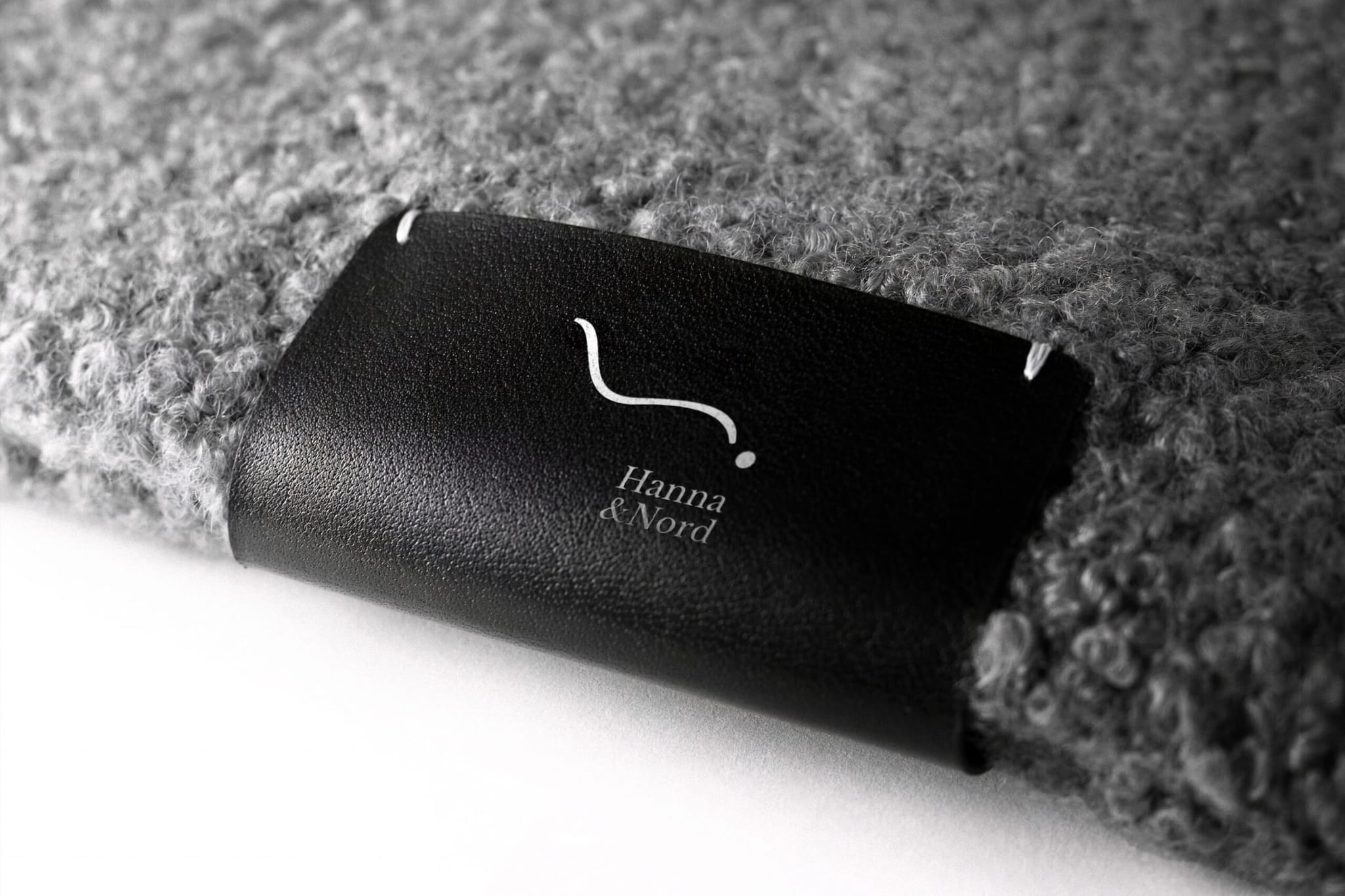
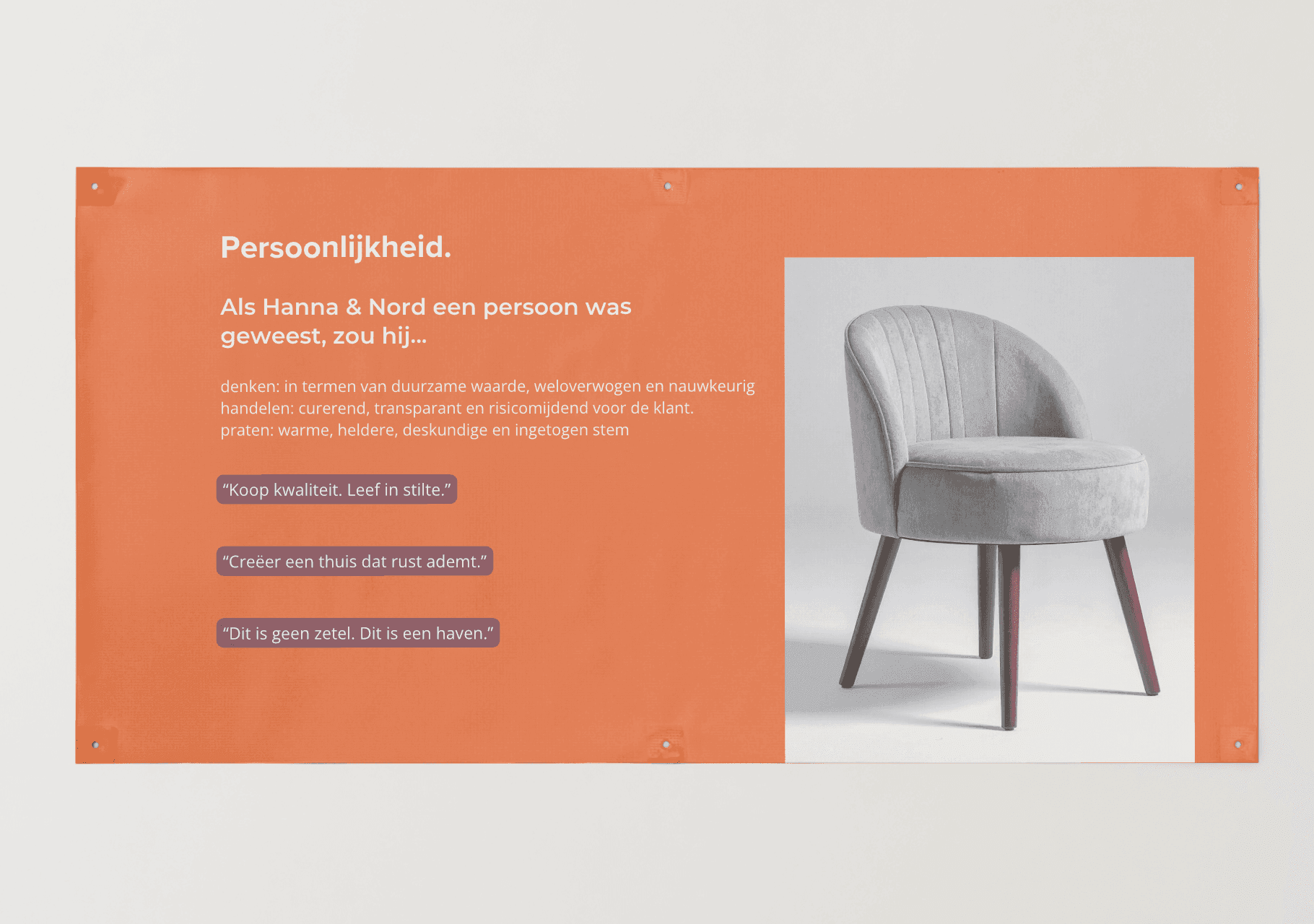
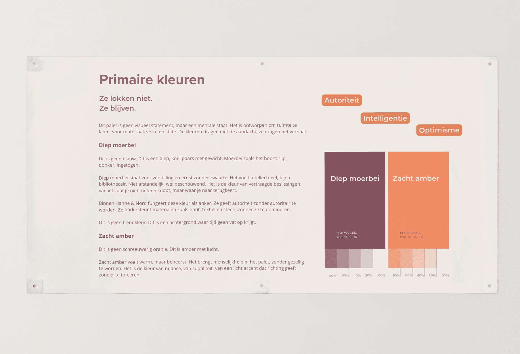
We crafted a complete brand identity where calm is not just described, but deeply felt. We established a rock-solid foundation: a clear purpose, vision, and mission that position the brand as a counterbalance to ephemeral trends and visual clutter. The tone of voice became warm, composed, and authoritative—never pushy, always reassuring. Visually, we selected a color palette and editorial typography that offer breathing space, command trust without demanding attention, and build enduring confidence. Colors reflect mental states rather than decorative accents. Typography is crisp and legible without theatricality. Grounded in classic archetypes (The Creator and The Sage), Hanna & Nord invites personal expression while guaranteeing reassurance through knowledge, transparency, and digital clarity.
Results & Impact
A strong brand does not shout louder to make sales; it puts people at ease. For Hanna & Nord, this identity marked a decisive shift from a transactional webshop to an aspirational sanctuary. Internally, it established clarity and focus; externally, it created a brand that competes on trust rather than noise. In a crowded marketplace, that is not an aesthetic choice—it is a sustainable competitive advantage.
How the brand became a shop: its own platform, stock that guards itself, and one admin instead of separate subscriptions.