

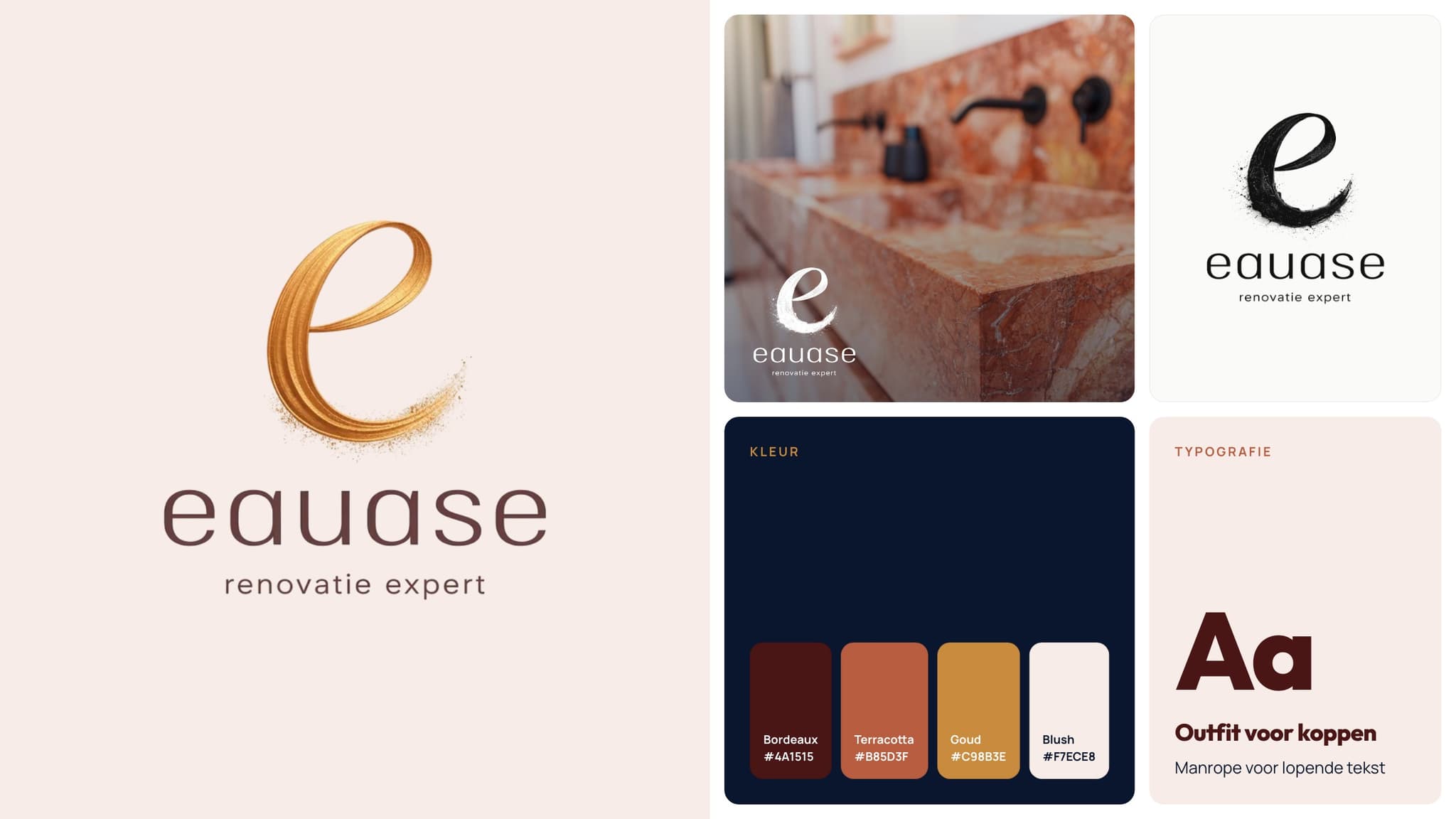
01 — Brand
From hexagon to brushstroke.
The old logo had the shape of a construction firm. The new brushstroke e feels like craftsmanship, set by hand. It comes in gold, black and white, and works on photos, paper and screens.
LogoColourTypography

Case · Eauase
A new logo, a new website, our own photography and ten interview reels: how a renovation company repositioned itself in the high-end segment.
The question
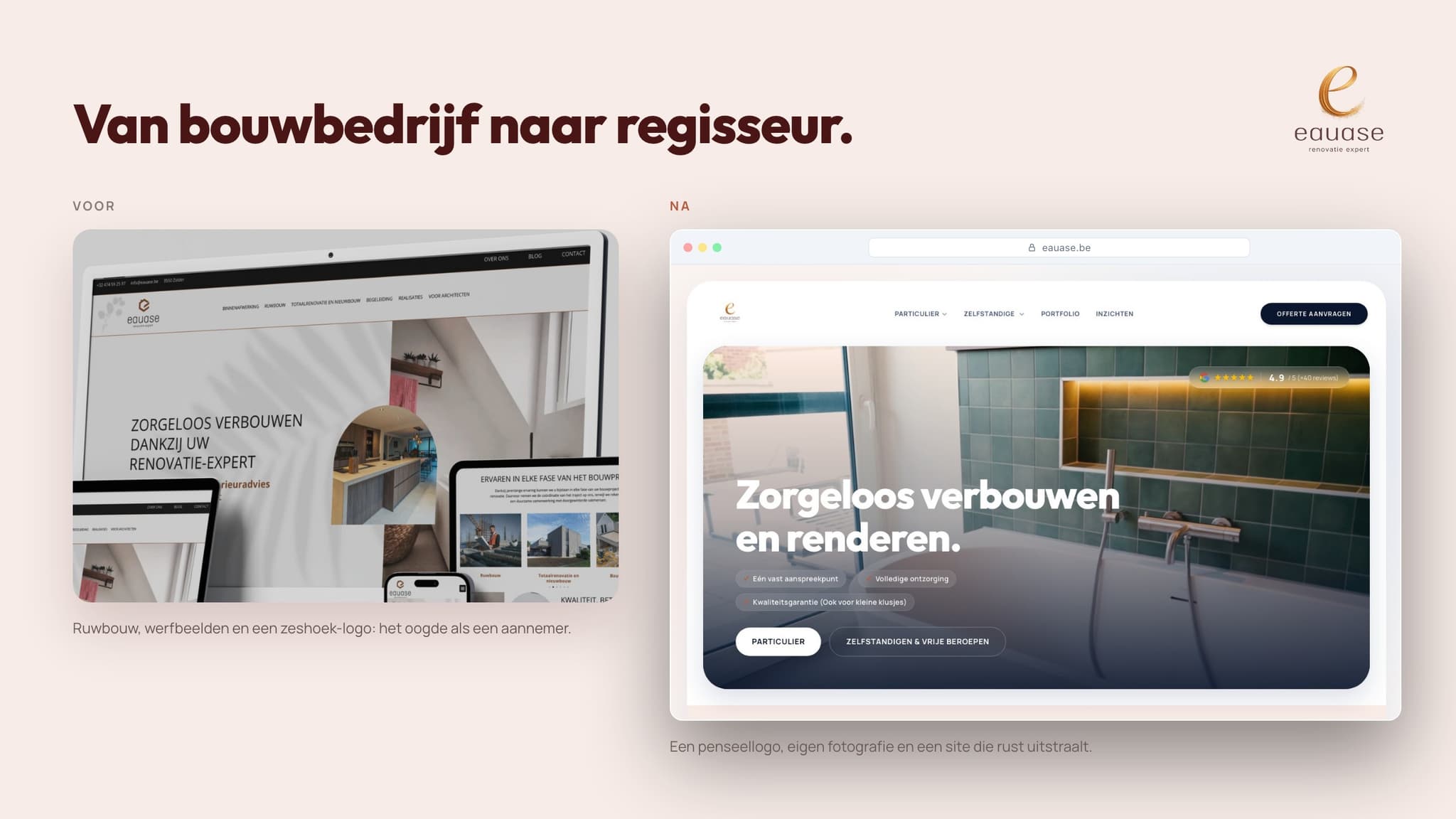
Renovation is booming in Flanders, and supply grows with demand. Including the cheap kind. Founder Kristof Devries watched the market fill up with contractors competing on price, while Eauase delivers bathrooms and full renovations where design and finish make the difference. You just couldn't see it. The old logo looked like any construction firm. The website worked poorly on mobile, was vulnerable and no longer matched how people search today. The question: how do you make a brand look as good as the work it delivers?
The idea
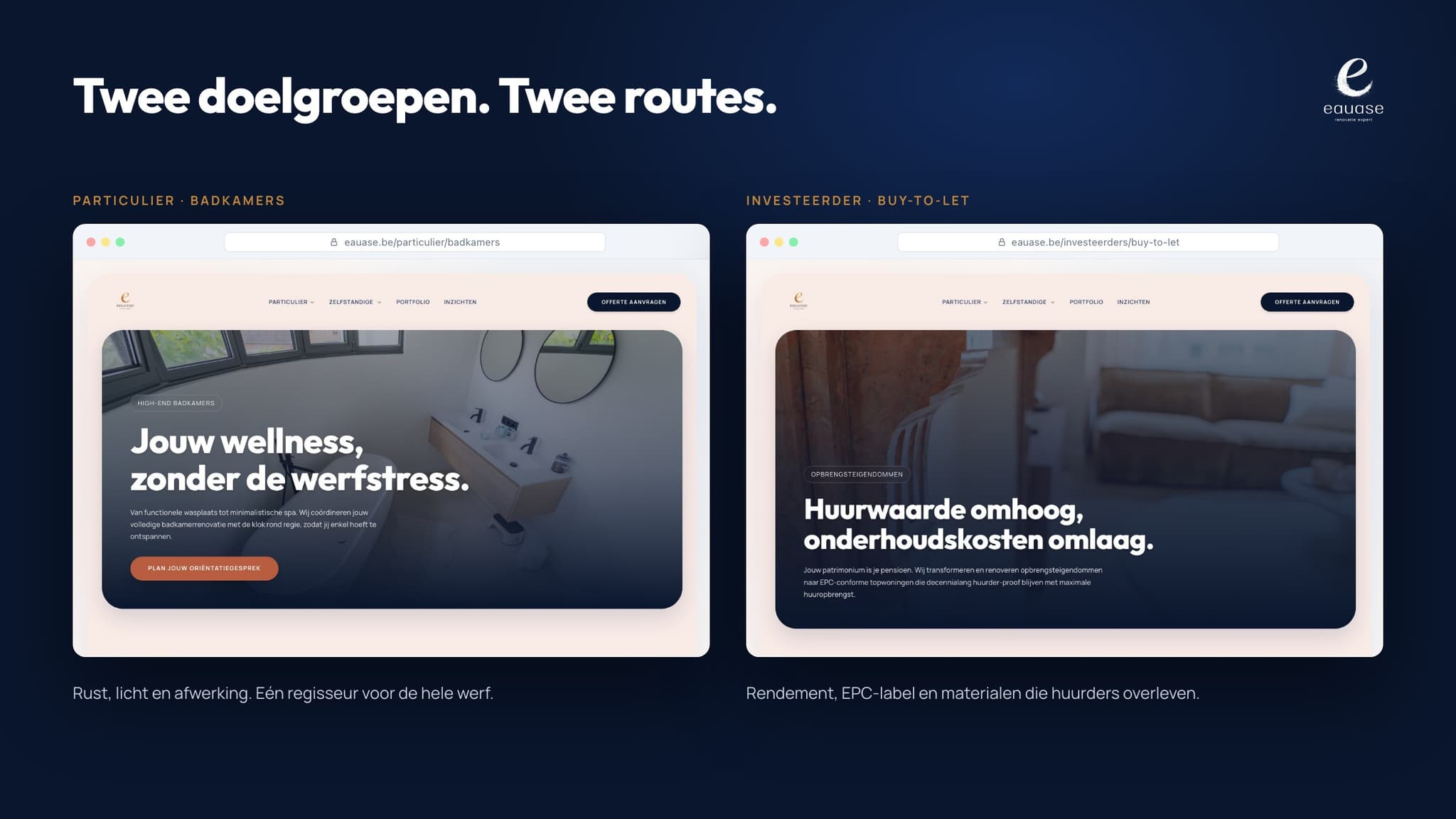
You don't win a repositioning with bigger words, but with what you dare to show. We made three choices at once. The work does the talking: every project in our own photography and video, no stock images, no empty promises. The brand shifts from contractor to director, the partner who oversees the whole site. And every visitor picks a route straight away: homeowner or investor, each with their own questions and their own answers.
The execution
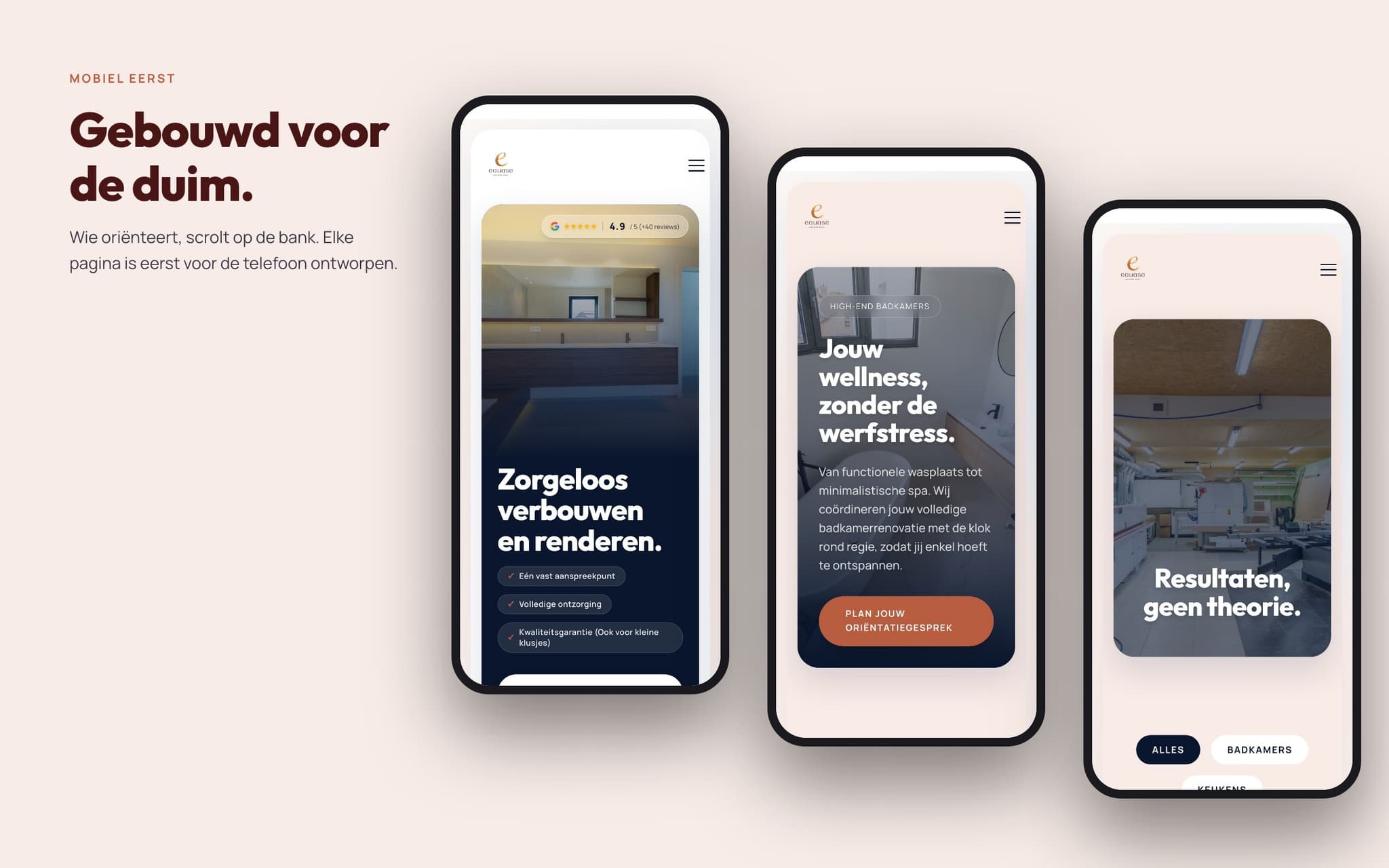
It started with the logo. The hexagonal builder's symbol made way for a golden brushstroke e: warm, hand-set, with the calm of a finished bathroom. Around it came a palette of burgundy, terracotta and gold. The new website is a custom web application, mobile first and free of the weak spots of a standard WordPress site. Homeowners find bathrooms, kitchens and full renovations. Investors find buy-to-let, fix-and-flip and the mandatory energy renovation, with a calculator that shows what a better energy label is worth. We photographed and filmed every project ourselves, from the marble washbasin in Genk to the flat in Ostend. And Kristof stepped in front of the camera himself: ten interview reels answering the questions clients really ask.
01 — Brand
The old logo had the shape of a construction firm. The new brushstroke e feels like craftsmanship, set by hand. It comes in gold, black and white, and works on photos, paper and screens.
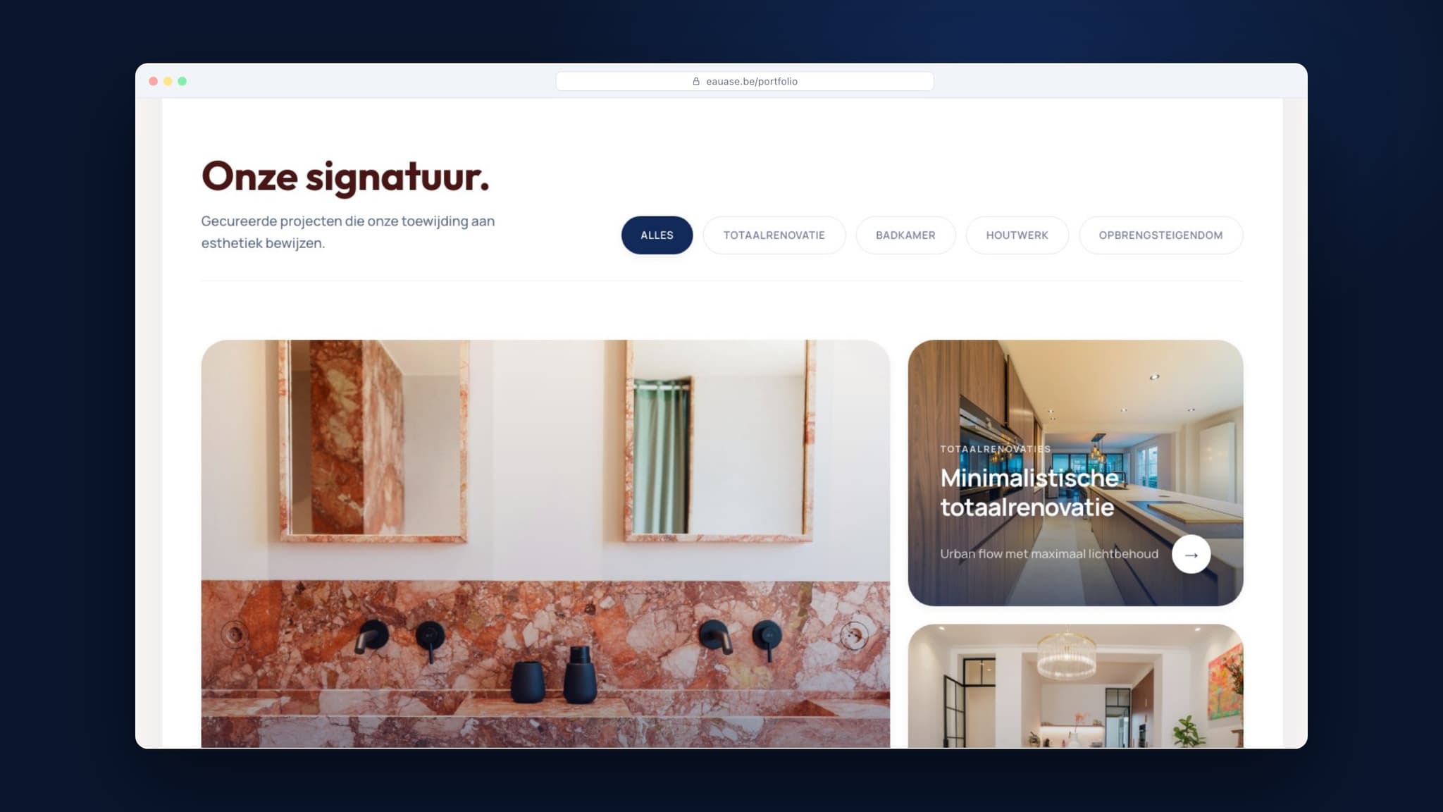
02 — Website
Homeowners land on calm, light and finish. Investors on returns, energy labels and tenant-proof materials. A calculator turns an energy upgrade into a figure, and the portfolio shows every project with filters.
 Mobile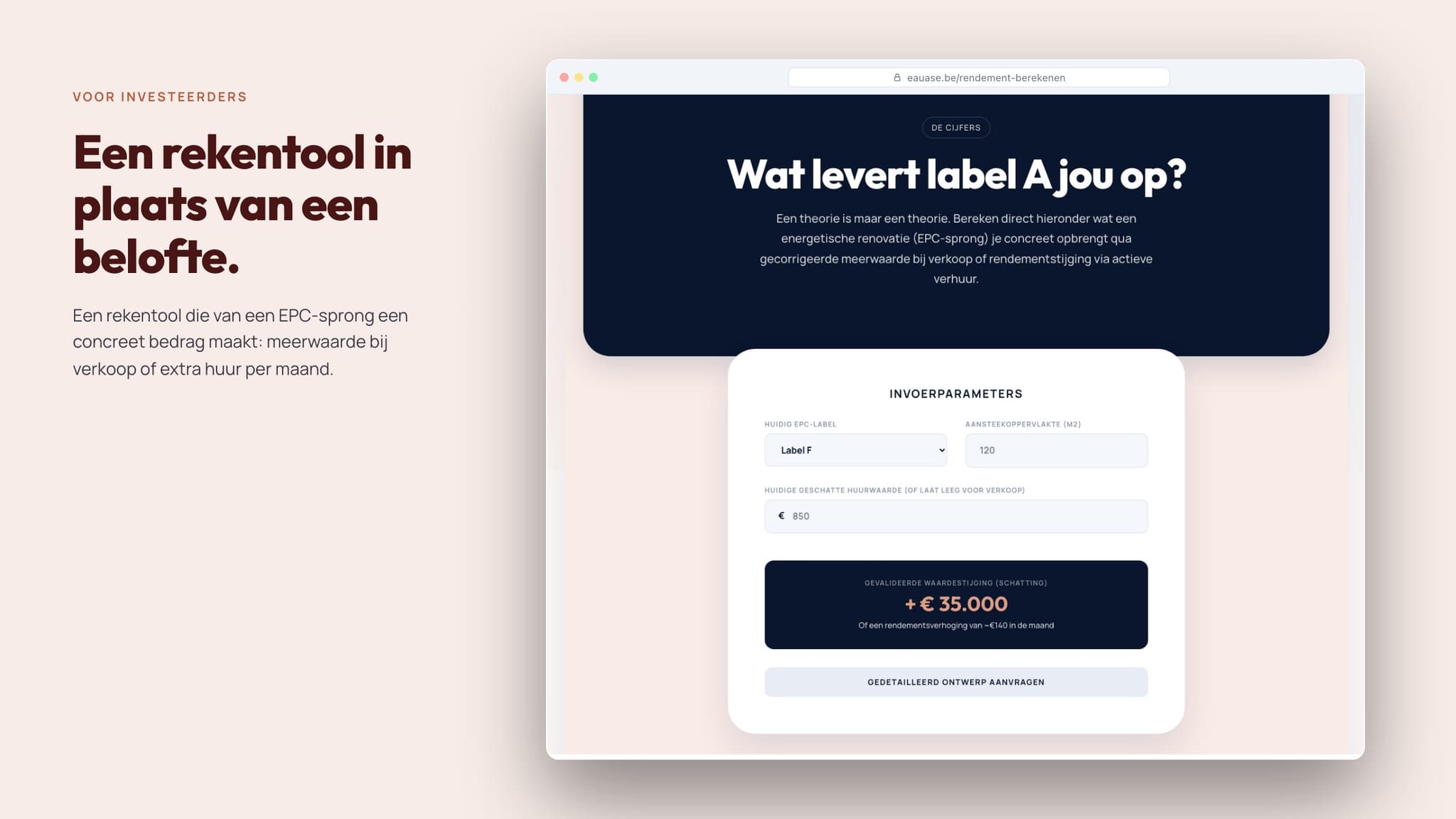
03 — Photography and video
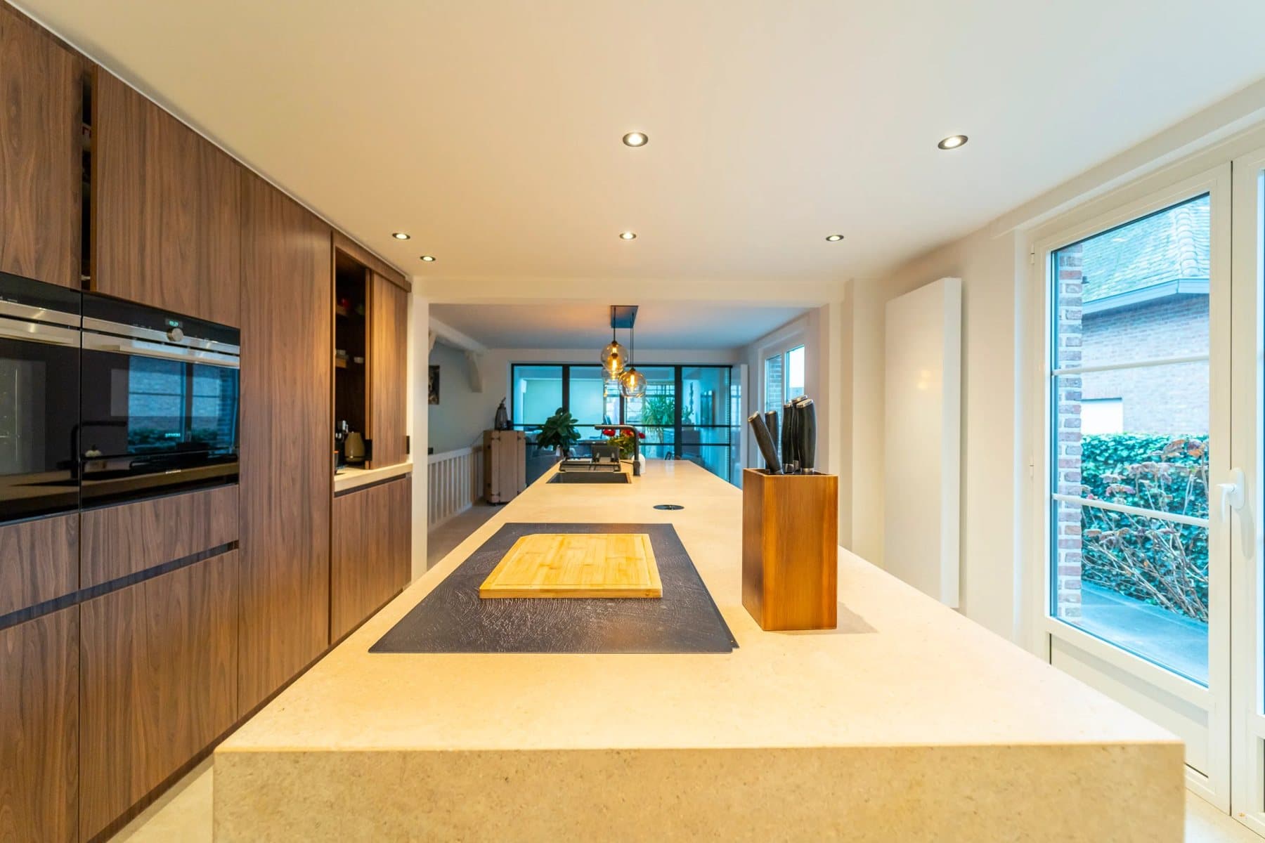
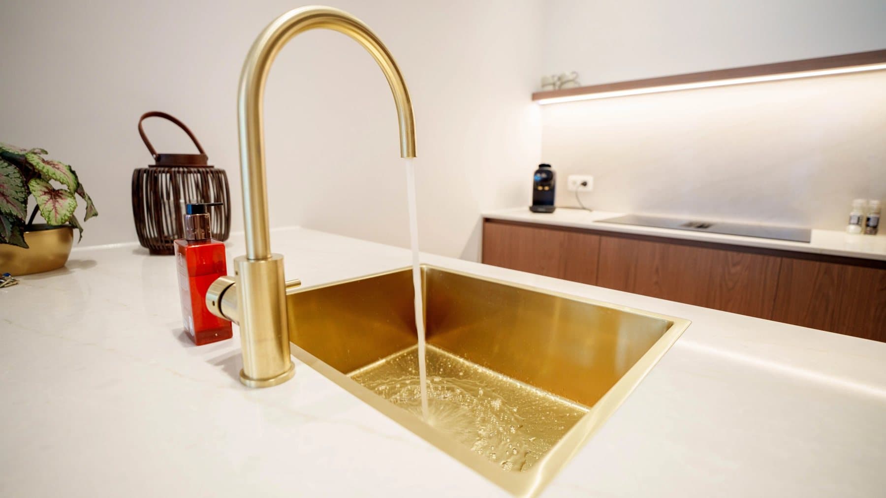
We photographed and filmed every project ourselves: slow camera moves, natural light, details you only notice when you stand still. Those images carry the entire website, from the hero to the portfolio.
 Marble bathroom · Genk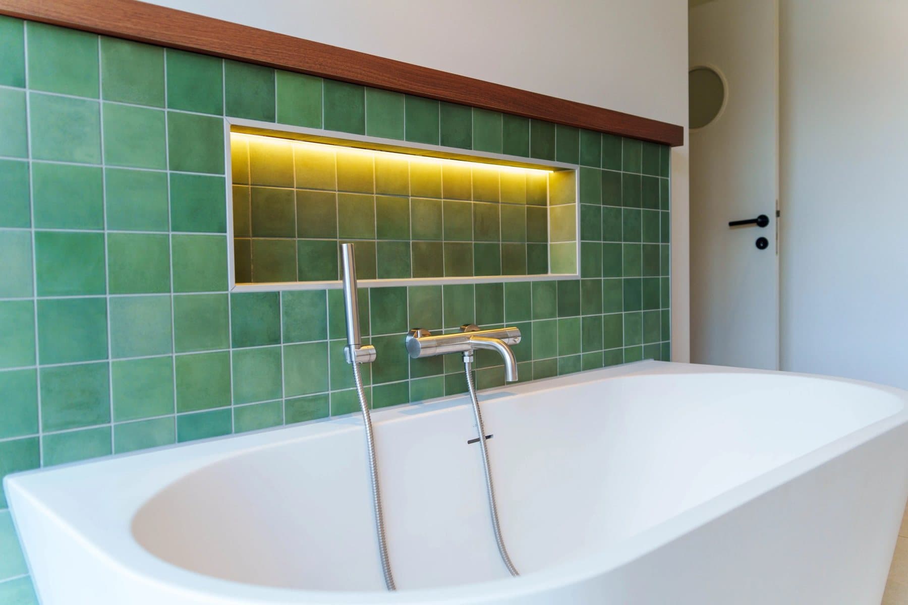
Kristof in his own words
Not an advert, but the founder himself. In short interview reels, Kristof Devries answers the questions he hears every week, from seamless bathrooms to renovating at the coast.
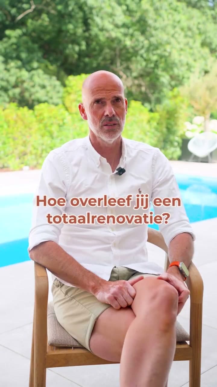
How do you survive a full renovation?
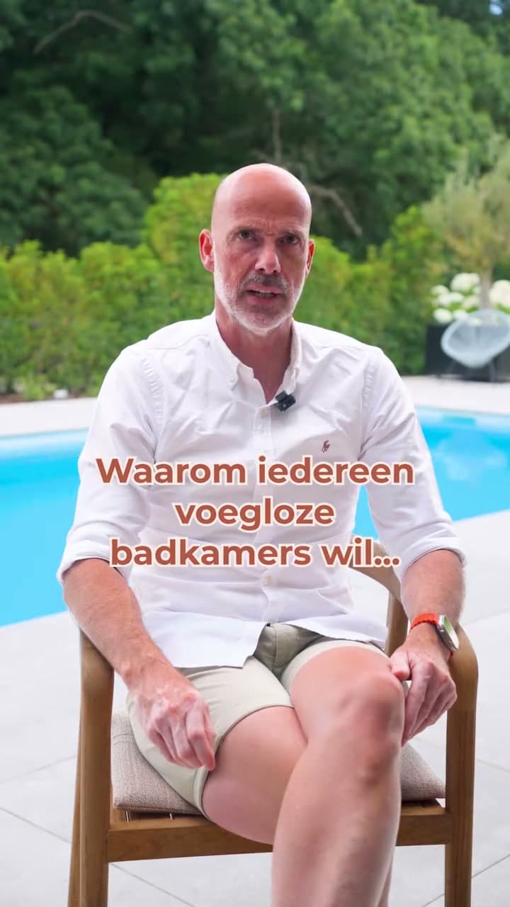
Why everyone wants a seamless bathroom
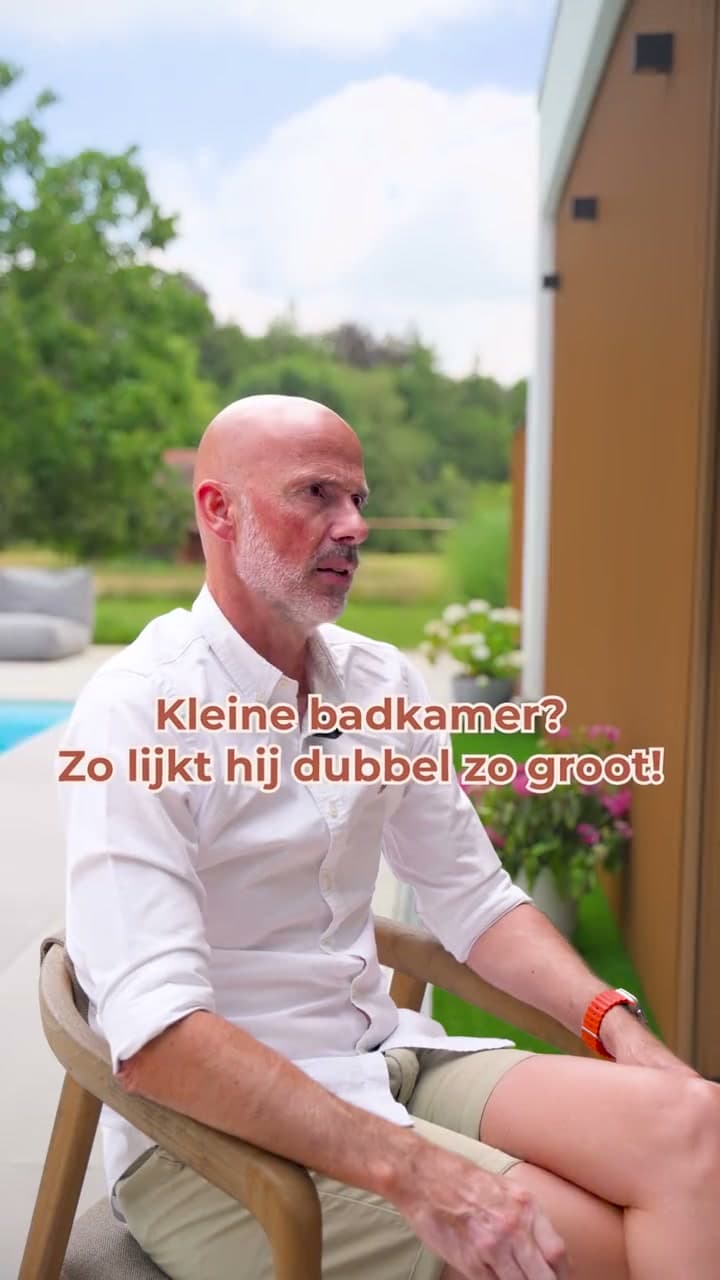
A small bathroom that feels twice the size
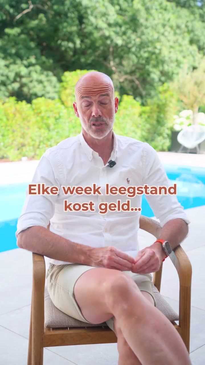
Every empty week costs money
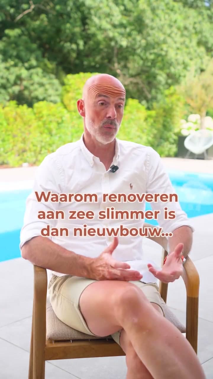
Why renovating at the coast beats building new
Reflection
A new logo changes nothing, until it changes how people see you. Since the launch, more relevant enquiries come in, from people looking for exactly what Eauase makes. The public sees the brand as it was meant to be seen. And the best effect was on the client: Eauase began to act on its new position and now develops its own high-end projects. Repositioning isn't a new coat. It's a mirror in which you finally see what you could already do. Feel free to put 1.0 and 2.0 side by side.
Compare them
Make sales predictable by showcasing your craftsmanship repeatedly.How we brought rhythm to Eauase's content earlier, with the brand and website of the time.
Let's explore together how we can elevate your brand, digital interface, or media production.


